Landing Pages that converts feature
How to create Landing Pages that convert – making Facebook ads deliver
You’ll likely know that Facebook has over 2 billion daily active users. Each of these people spends an average of 35 mins per day on the platform, visiting around 8 times per day. So it’s no surprise that Facebook ad spend represents the biggest chunk of global ad spend on Social Media Platforms, accounting for 18% in 2017. And somehow, and no doubt through your own ingenuity, someone has clicked on your ad from amongst the 317,000 status updates per minute, 147,000 photos uploaded and 54,000 shared links. It’s said that images account for 75-90% of Facebook Advertising Performance. Consequently, if someone has already clicked, then your creatives have essentially delivered. And people are clicking. More than ever in fact. Since the controversy created by the Cambridge Analytica scandal, Facebook ad spending increased 62%, earning Facebook $7.68 billion from advertising in Q1 of 2017.
Let’s look at this in a little more detail.
The average CPC is $1.72. This of course varies per industry, with Finance and Insurance topping the chart at $3.77 per ad, and Travel and Hospitality coming in at the lowest at $0.63.If you’re not already doing so, you might find it interesting to look at your ad performance versus industry averages to help benchmark your ad quality. Yes, yes, obvious stuff you say. Well here’s the real crux of the issue. Based on US data, the average CTR is 0.9%, with industries including Legal (1.61%), Retail (1.59%) and Apparel (1.24%) coming in at the top and Employment (0.47%), Customer Services (0.62%) and Home Improvement (0.70%) coming in at the bottom. But what does this mean? Well, it may be that certain industries attract a wider demographic, and it might be that some have simply nailed Facebook Ad Copy and creative design but what about actual conversions? Let’s consider these ‘best and worst performers.
“You’ll see straight away that some of our star performers when it comes to CTR are simply failing at Conversion when you look at the ratios.”And it’s not like there is an immediate answer. Take legal for example. This could range in a service from personal injury to a B2B marketing campaign for an FS M&A offering for enterprises, so it would be fair to counter in saying that conversions will be industry-specific. But why is Home Improvement outshining Retail? Take this one step further and you’ll find Fitness Studios who average out at CTRs of 1% and are in that respect completely middle of the road, but completely excel when it comes to conversion, hitting averages of 14.29%. What is going on? When we’re talking conversion here, we’re assuming the ad has been successful.“What’s of key interest to conversion is landing page quality.”
Why bad landing pages are ruining your CRO
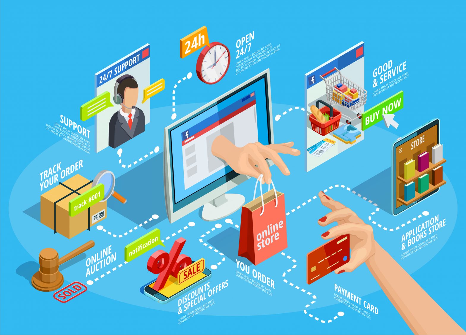
Ad Targeting
OK, we said we wouldn’t go back to the Ads, but it’s not quite what we’re getting at. The issue here is redundant targeting. Yes, your ad is successful and is clearly grabbing the attention of males aged 34-45 who are interested in cricket, but your landing page is selling cricket bats. Not only that, it’s a promotion for cricket bats that are in the price range of a teenager who has saved up his pennies cleaning cars and is looking for something to mess around within the park on Saturdays. It’s all wrong. So the secret sauce is that the ad has to fit the landing page – PERFECTLY.
Take this ad from Custom link: The ad begins by inviting people to order today and receive your shirts exactly when you need them.No problem and in principle this ok but the image shows a hoodie. So, do you go by the ad copy or the image? Unless you are selling both, you will lose one or the other customer group as soon as the ad is clicked on. Moreover, the second part of the copy opens the promotion to a variety of groups.
This would have been the perfect opportunity to segment out these groups and target them individually.
Instead, you will need a one-size-fits-all generic landing page to capture the interest of the aforementioned shirt and hoodie purchasers, as well as all the above groups who are most likely looking for bulk, buys with a likely discount. If the conversion was the goal here, then the business has reduced its chances.
Never A/B testing (or testing per se) your landing pages
Whilst instinct is a powerful tool in the marketer’s arsenal, it would be foolish to let it supersede data-driven decision making and interfere with the success of your campaigns. As a rule of thumb trust your intuition but don’t make assumptions, especially if you’re burning money on ads that aren’t converting. Set limits and pull the plug when necessary.“Far too many marketers hover over detailed reports about ad performance, whilst at the same time neglecting to do the same for their landing pages.”
This portion of the campaign optimisation might simply involve plugging in some basic GA stats, usually social traffic, bounce rate, average time spent on page etc. Those with a little more experience will have set the CTAs up as conversions in their Google Analytics account, and this is where Tag Manager really comes into play.
If you aren’t using tag manager, the first thing to do is to set up your account and send the code snippet over to your developer. Google provides comprehensive instructions on how to create the container that will be installed on your site. Use Google Tag Manager as a shortcut solution to having to modify the code on your landing page, to help you track things like lead magnets, video views and slide-in JavaScript CTAs.This will really help beef up your reporting and give you the insight and confidence to adjust your page variations when you split test. GTM also gives you the tools you need to integrate GTM tracking on respective landing pages with the tracking on your main website, in the event you are A/B testing landing pages as subdomains. Depending on how much time you want to invest, you might find it useful to review Google’s Optimize feature, released last year. We particularly liked the multivariate testing that, in Google’s own words, ‘allows you to test two or more elements on a page to see which combination creates the best outcome for your site. By analyzing the interactions between the elements, Optimize will help you find the best overall combination of elements on your page.’
“A/B testing your pages is your customers’ gift to you. They tell you what they like and what they don’t, allowing you to better understand where your marketing is succeeding, and ultimately delivers a higher conversion rate and increased sales.”
Designing landing pages that convert
Sometimes, all that is required is to make one landing page that hits all the marks and consistently bring in revenue. Sadly, not everyone can be so lucky or successful on the first go. When we talk about landing pages, it’s good to see these as part of your campaign, rather than just driving people by default to your homepage and hoping that they click the CTA button.If your purpose, however, is to drive a bottom line, you need to invest a little more time. Landing pages that succeed in converting should be designed with that purpose in mind. By the same rationale, therefore, you need to consider where your landing page fits into the marketing funnel. We aren’t talking awareness here, we’re talking conversion. More and more marketers are devoting themselves to this attitude, with (according to Hubspot) almost half creating new pages for each campaign.
Make First Impressions Count
Your prospect’s first impression is of paramount priority.
A quick Google search will reveal a variety of stats for how long people spend on a webpage and if you approach your own website based on someone telling you that people only spend 8 seconds per page you might end up with a skewed perspective on your own stats. Do apply common sense. The easiest way to isolate your website performance is to record averages over the last year in your Google Analytics account and work from that. Otherwise, you’ll waste time comparing yourself to either a very broad mean or an industry that might not have anything to do with your own. When people are informing their initial impressions, they will react to content in different ways. Don’t forget that we are people after all. You wouldn’t meet someone and immediately go into a diatribe about yourself fuelled by your personal perceptions. And especially not negative ones. People like to feel respected and be positively received. In the first edition of the Critique of Pure Reason, Kant said:
“The imagination is a necessary ingredient of perception itself.”He then later explained that ‘Our cognition arises from two fundamental sources in the mind, the first of which is the reception of representations (the receptivity of impressions), the second the faculty for cognizing an object by means of these representations (spontaneity of concepts); through the former, an object is given to us, through the latter it is thought in relation to that representation… Intuition and concepts, therefore, constitute the elements of all our cognition’.“We process images 60,000 times faster than we do text, so our initial visual interpretation will also correspond to our overall initial impressions.“Savvy marketers will use images to then direct viewers’ attention towards the relevant content, as Drift has done so well below. You can easily visualise the heatmap here.Or in this example from Apple, where the copy immediately reinforces and guides the first impressions that the image creates:Bear in mind that if you’re using large images or videos you might want to test your page loading speed and consider if the bulk of your audience has access to fast internet, otherwise you risk losing them before your message even hits home. If this is the case, stick to small images that appeal to your brain’s sense of visual information processing and get your message across quickly with text.
Calls-to-Action
CTAs are our marketing bread and butter, but you should know how to best use these in consideration your customers and industry. A landing page for an FMCG business with a summer deal on perfume will have very different CTA placement when compared to a B2B business offering warehouse management software; without wishing to sound too obvious.Let’s think about two best practice situations for CTA placement and CTA phrasing.“The default that marketers often resort to is placing the CTA above the fold. Some of us stick to this so religiously that you’ll notice the CTA following you as you scroll down the page, like an irritating hawker you’ve been trying to shrug off for the last two streets in your stroll around Marrakesh.”</
It’s not uncommon to see stats like, ‘80% of consumer attention is placed above the fold’. Fine, but this doesn’t mean you can’t experiment. However, you might want to use the tried and tested method if you’re putting significant investment into a campaign to minimise risk if you’re not confident. We’d suggest that unless you’re building 3+ landing pages per campaign it’s safest to stick to an above the fold CTA. If you do make three, then test a below the fold action on one of them only. More often than not, you’ll find that just like on a restaurant menu, people order from the top right. Nevertheless, some businesses, particularly those with a complex product offering or those new kids on the block, might wish to allow their readers to digest a little about who and what they are before inserting the CTA. See this example from the Economist. Yes, they’ve got a subtle button on the top right, but the real investment is in the CTA at the bottom of the page. The premise is that as the reader scrolls down and appreciates all of what they could be experiencing they will be automatically enticed. Then comes the hook. The next thing to look at is phrasing. There is a fine line between being too pushy, too vague or failing to adhere to your brand’s tone of voice. Take a page from Mailchimp’s book, whose landing page avoids these pitfalls and really stands out as a great piece of marketing. The ToV is distinct and confident. Notice the harmony between the text and the design, and how well the images cradle the message and CTA on the page. The phrasing here achieves several things at once. Firstly, the heading addresses two of marketers’ biggest obsessions in one go and appeals both to the ‘brand crowd’ and the ‘ROI crowd’.
At this point it’s already very tempting to click on that cool blue button that’s one step away from ordering the piña colada by the sea (as evoked by the imagery), and then you read the subtext which only ads to the primary message in reinforcing the brand promise in that millions of other people are already drinking said piña coladas, having clicked the blue button – and are making money while doing so.
Here are some of our top tips for successful Call to Action Buttons and Phrasing
- Experiment with colour. We subconsciously react to colour contrast and our instinct is to alleviate it. The easiest way to do this is to click the button.
- Action Is the key word here. This isn’t a love poem. Use verbs and imperatives to drive people to download, send, trial and start now.
- Craft phrases that appeal to your audience by empowering them, justifying them, and guaranteeing them the solutions to their jobs to be done.
Client testimonials – when and where to use endorsement
Client testimonials can really help boost prospector confidence in your offering but don’t waste your own or your readers time by putting in testimonials that seem like they’ve been pulled out of thin air and don’t say who the customer is, who they work for, and if the product is even yours. You may as well be a mediocre restaurant in the middle of nowhere paying people to distribute generic messages about how delicious your food was, and how the service was divine, and how you’d recommend taking your family there for large events such as weddings.
Also, don’t put the whole client testimonial on the page. No one needs to read 300 words of praise in a huge block.
Instead, handpick testimonials that mention your product and have a clear and verifiable source. Use quotes sparingly or your page will end up looking like an obituary for the bar regular everyone knew from Friday nights.
In terms of positioning, these can comfortably sit below the fold. Let people understand your offering and lure them in first. Let the testimonial be what tips those in doubt over the edge. And to conclude, take emotion out of the equation once the campaign has had a chance to settle in and is running. If the results aren’t coming in, then rebuild, redirect and optimise. Landing page marketing is about driving results and stealing a phrase from Charlie Chaplin, ‘this is a ruthless world and one must be ruthless to cope with it.’
Try Demo – Filed, Marketing Software
Follow us on Instagram for blog updates – Instagram, Filed AI