
10 Landing Page Examples to Inspire You
You’ve nailed the creative, the targeting, the ad copy… you’ve gotten that oh-so-coveted click. What happens next? The user is finally on your landing page!
Now what exactly is a landing page?
A landing page is created specifically for the purpose of a marketing or advertising campaign. Typically, a landing page will offer a resource or some other benefit in exchange for some contact information.
Landing pages are an excellent way to generate leads, get users into your email funnel, and get some tasty sales under your belt.
But you can’t justcreate a landing pagehowever you want – there are some tried and true best practices out there that are statistically proven to make a user more likely to convert. A well-designed landing page will eliminate confusion about what they have to do to receive your offer, making theconversion processeasy to understand.We’ll start off with defining the best practices out there, then move on to 10 landing page examples that will inspire you to create your own for your website.

Tip 1 – Make Sure You Have the Must-Haves
A landing page needs to have the following four elements to be successful:
- Headline– with a clear, punchy title
- Brief Description– clearly explaining and emphasizing the value
- Image– have at least one image that supports your text
- Webform– for the visitor to input their information – arguably the most important part!
Tip 2 – Understand Your Target Audiences
Many brands have multiple target audiences that fall within their business. Why is this important? When you’re creating your advertising campaigns, you will want to ensure that your landing pages are catering specifically to them.
Maybe one of yourtarget audiencesis drawn to the functional benefits of your product or service: how it’s made, what it’s made of. And maybe another is more about the aesthetic of your brand. These are different brand attributes that you would want to make clear in two separate landing pages for your campaigns.
Tip 3 – Don’t Include Navigation to Your Website
Nowhere on your landing page should there be link back to your actual website. Why? The only clickable link on the landing page should be the CTA button.Offering any other links on your site invites a user to navigate off of your landing page, get distracted by something else on your website, and end up not converting.
Tip 4 – Be Consistent with Your Offer
This one’s a little obvious, but make sure that the offer you’re displaying in your ads is the same offer as what you’re offering on your landing page. The CTA should be consistent with the offer in the ad. If your initial link has a CTA that reads, “Get your free trial!” but the CTA on your landing page reads “Sign up”, you’re just introducing a little more confusion – potentially driving your site visitor straight into the arms of another competitor.
Tip 5 – Simplicity is Best
While you definitely want your branding to shine through in your landing pages, make sure you leave enough room for whitespace too. Having too busy of a landing page is a sure-fire way to make your business look cheap, and make the important information get lost in the mess.
Tip 6 – Split-Test Landing Pages
You always want to be testingto see what landing pages are performing the best in terms of conversions. You can test out different CTAs, different placements, even different colours to understand what it is exactly that your target audiences are looking for the most.
The Examples of landing pages
So now that you know the formula of creating an amazing landing page, it’s time to look at some examples of very successful, super-converting landing pages to get you inspired for your own business. We have 10 examples that we’ll show you.
Lyft
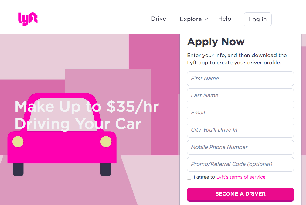
The first example we’ll take a look at isLyft. This landing page has been created specifically for potential Lyftdrivers,not Lyft riders. This ties back to our second tip from above.
Understanding what different consumers your business is targeting is the first step in creating something for them.
Now take a look at the colour, the design. It’s in Lyft’s brand colours, font, and the CTA states clearly “Become a Driver”, reinforcing the idea that this landing page was made specifically for people looking to drive for some extra cash.
TransferWise
![]()
TransferWiseis a brand that allows its customers to send money back and forth across borders with ease. Let’s take a look at this landing page in a little more depth.
The heading gives a clear benefit: A cheaper way to send money internationally. Though basing your USP on price isn’t always a guaranteed way to succeed, we can see here that the value of using TransferWise is clearly communicated right away.
We also see a nice fee breakdown, showing a user exactly how much their recipient will receive when using the service. Each tab on this landing page will produce a separate CTA based on what you’re signing up for – each one in a vibrant green box that highlights the next step after the three possible starting points.
Litmus
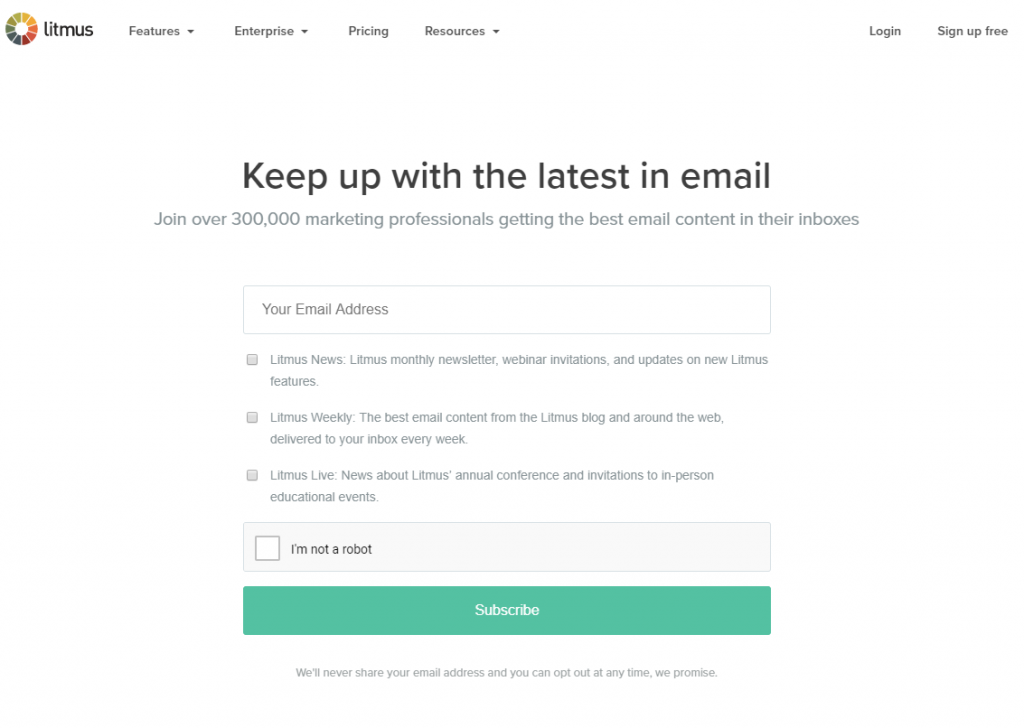
The headline here is super simple and inviting. The form is also incredibly easy – rather than asking for a multitude of information, like a name, address, etcetera, this landing page simply asks for an email address.
You can also take a peek at the previous newsletters that the brand has sent out, to get a better feel of what kind of content you’ll be signing up for in the future.
Codecademy
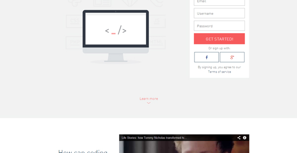
The very first thing that your eyes are drawn to is the bright red CTA. There is also the ability to sign up with either your Facebook or Google Plus account.
It isn’t until beneath the fold that we see a video to clearly explain how exactly coding can help you. You always want to be able to answer “Why this brand?” in anything that you do.
Sprout Social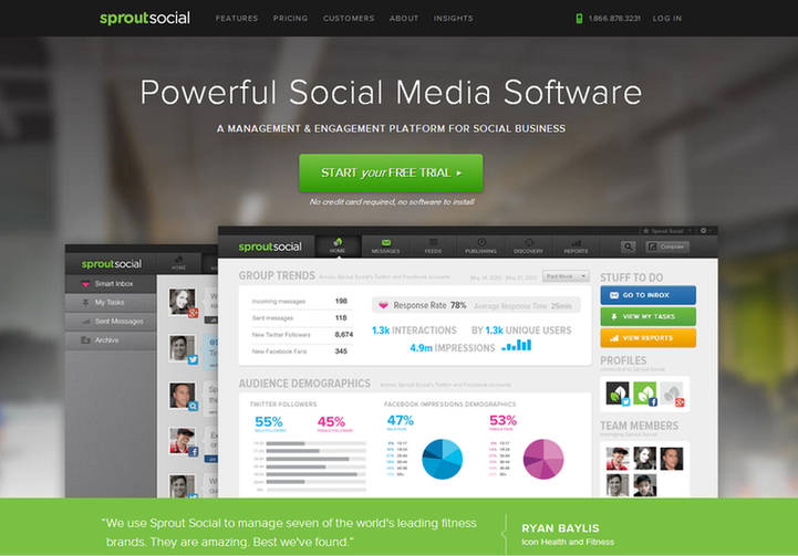
Sprout Socialis a magnificent tool in regards to social media management. This landing page features a huge green CTA in the centre of the page, inviting the user to click and start their free trial right away.The images below also show off what the platform actually looks like to those that are interested. There are testimonials underneath at the bottom bar, giving a little extra social proof to those that still might be in doubt.
Trendy Butler

AnAI-poweredclothing subscription service,Trendy Butlerempowers its customers to create a specially curated closet.
The headline here pops out and is incredibly eye-catching. You can see that there aren’t any links that lead the viewer off the site, and the page has plenty of whitespace.
Orbitz
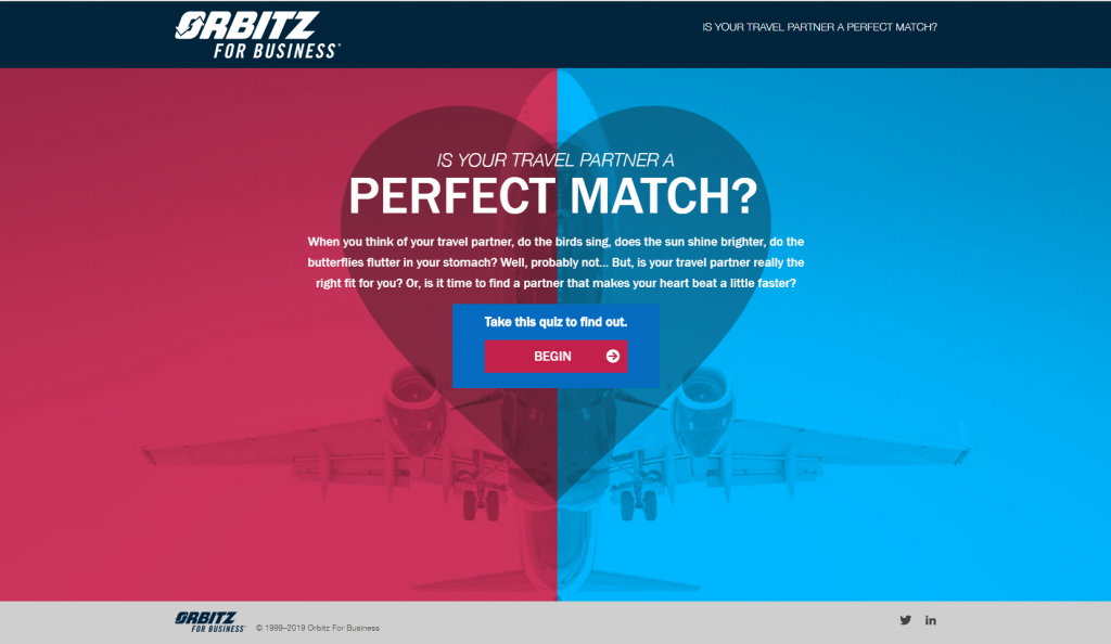
Here is a little more of a unique one. A quiz as a landing page is a great way to encourage engagement and get some unique content out there. After the quiz has finished, the user is prompted to enter their email address to get their results. Interactive content makes consumers feel much more connected and invested in a brand than they do when faced with a plain, standalone landing page asking for some information.
Tony Robbins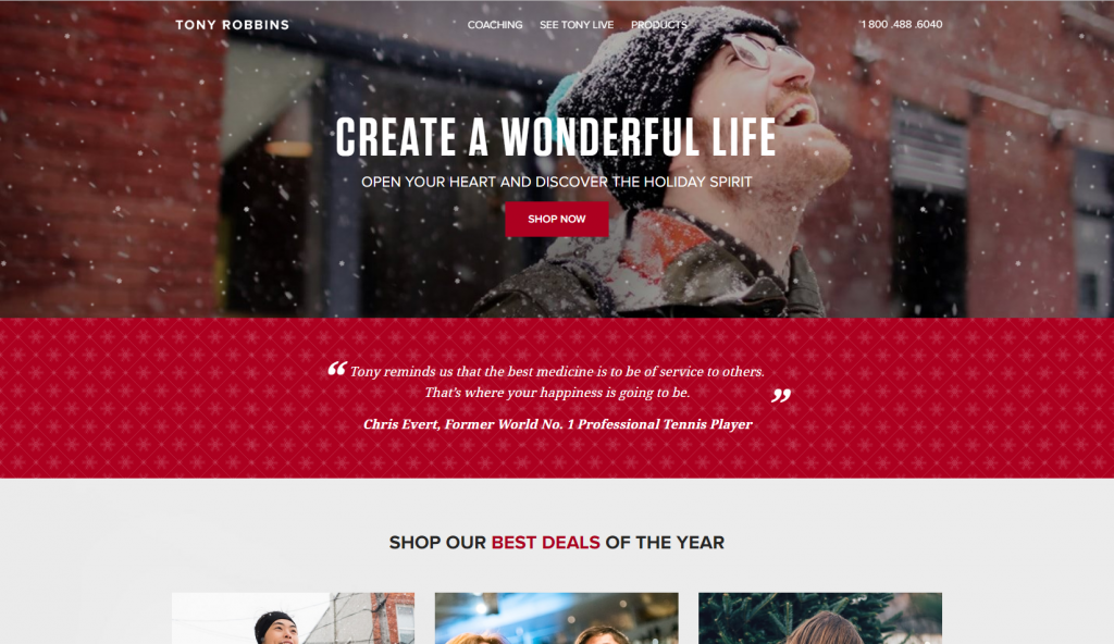
Tony Robbins is an American author, philanthropist, and life coach. Known for his several self-help books, Robbins created this landing page as a Christmas campaign to prompt viewers into shopping at his store. This landing page from Tony Robbins has some really great points. The call-to-action button is nicely centered in the middle of the page. There is also a big testimonial from world-famous tennis player Christ Evert. This page is obviously specific to Christmastime. When creating your own landing pages, introducingthe element of seasonalitycan be a great way to increase engagement. You won’t have to show the same generic landing page to your entire audience. Consider split-testing different types of pages for your seasonal campaigns.
Professional Wingman
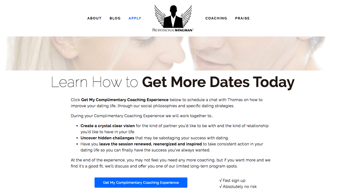
This landing page from dating coach Professional Wingman is a great example for brands that require a fair level of trust before converting. Sure, dating apps have been totally normalized today, but hiring an actual coach to help you secure dates? Well… think what you will.Professional Wingman dispels lots of hesitation by outlining exactly what his coaching experience will include… and it’s complimentary. Take note of his copy here as well. Using words like ‘complimentary’ rather than ‘free’ makes the experience seem more professional and discreet.
Always keep in mind your brand tone when crafting the copy of your landing page. It should always sound like the same person is writing your copy from behind the screen.
Breather
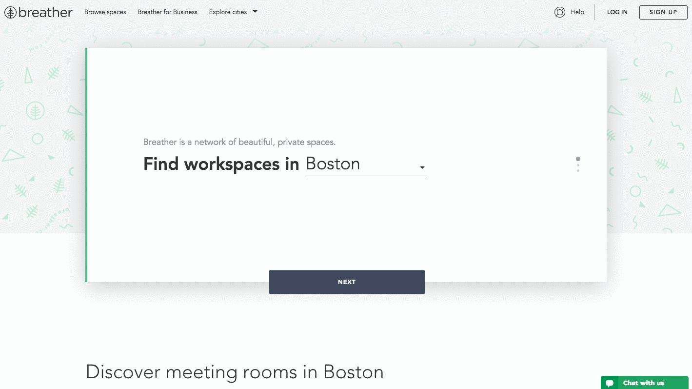
Our last example of the day here is a landing page from Breather. A modern private workspace company, Breather’s landing page gives you an instant Call to Action on their page. Powered by location services, you’ll find nearby office spaces right away.Again, we see the use of negative space and clean, simple copy to get the brand’s message across.Never forget to prioritise the customer experience!Of course, you’ll need to optimise for conversions when creating landing pages, but don’t lose sight of the design elements as well.
A Final Word
Crafting landing pages will always be a process that is unique to each business. As long as you keep in mind our six tips from above,continually test one variable at a time, and optimise for your top-performing pages, you will be on track to success.Want to see how Filed can help out with automatically split-testing your landing pages? Our AI, Dexter can show you!Book a free trial with us today, and see how Filed and transform your marketing.
Next Read- Create a Facebook App Installs Campaign that ConvertsCould AI Replace Creatives?
Follow us on Instagram for blog updates – Instagram, Filed AI